In class 2, we created a surveys about everyones favourite colour, food, animal, sport and t.v shows. Once we finished gathering all of our information, we made a tally chart with our information from the survey. After making our tally chart, we made a bar chart or a pie chart. We used it from a site called

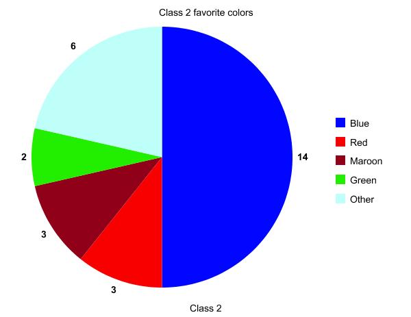
This is a pie chart about class 2’s favorite colours.
By looking at this pie chart, we can really see that the most favourite colour in class 2 is blue by 14. The least favourite in class 2 is colour is green by 2.
Here is a bar chart about class 2’s favorite sports.
Once again by looking at the bar chart. We can see that the most favorite sport in class 2 is Rugby by 9. We can’t tell the difference about the least favorite sport because Netball, Touch and other sports are a tie by two.

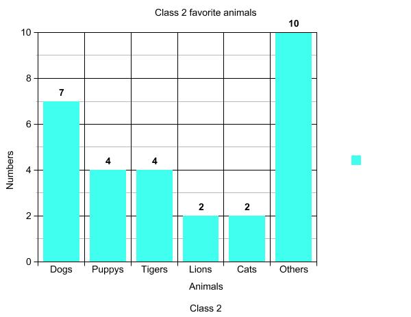
Now this is another bar chart about class 2’s favorite animals.
The most favorite animal in class 2 is dogs by 7. But really the most is the other animals by 10, because some people in class 2 like all sort’s of animals. Same thing again. We can’t really tell the differences between Lion’s and cat’s, because they have the same amount of number’s.

This is a pie chart about class 2’s favorite food.
The most favorite food in class 2 is Butter chicken by 6.
The least favorite food in class 2 is Fried rice and Toffee by 1. You can’t really tell the difference about Fried rice and Toffee because they both have the same amount.

Here’s a pie chart about class 2’s favorite T.v show.
The most favorite t.v show in class 2 is Regular show by 5. But really the most is the other t.v show by 7. Because people in class two like all sorts of t.v show. The least favorite t.v show in class 2 is Family guy and Neighbours by 1. We can’t really tell the difference between Family guy and Neighbours, because they have the same amount.
Try creating a graph. It’s fun.

